Different Arabic Calligraphy Styles And Their Uses
Whenever you look at a mosque dome, a printed Quran, or a book of Persian poetry, you’re seeing the same alphabet written in very different ways. Those differences aren’t random. Each Arabic calligraphy style has a different function; copying books, carving stone, drafting royal decrees, or jotting a quick note. This guide explains the major styles, where they came from, what they’re used for today, and how to pick one for your own project, whether that’s a wall print, a wedding invitation, or a design in Canva or Adobe.
What Makes One Calligraphy Style Different From Another
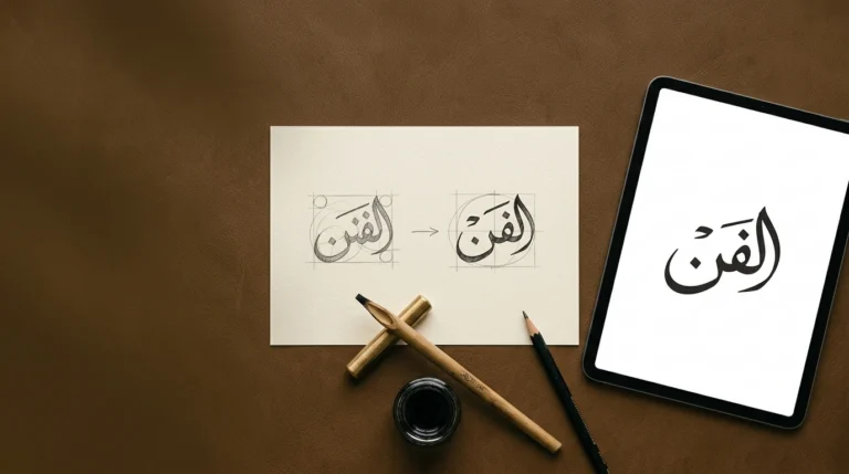
Arabic calligraphy, or khatt, isn’t just decorative handwriting. Every style follows rules for proportion, stroke shape, and how letters sit on the line. Traditionally, calligraphers measure letters in rhombic dots made by the flat-edged qalam (reed or bamboo pen), so the pen itself shapes each style’s character.
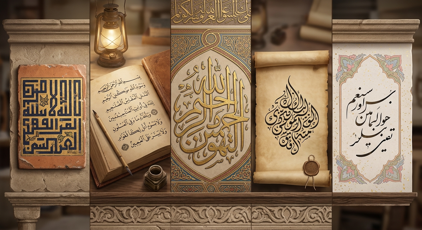
All styles use the same 28-letter Arabic alphabet. What changes is the treatment is tall or compact, angular or curved, spaced out or tightly packed. Many traditions recognize six classical cursive scripts, sometimes called the “Six Pens”; Thuluth, Naskh, Muhaqqaq, Rayhani, Tawqi’, and Riqa’. Kufic is older and angular, so it is not included. Diwani, Ruq’ah, Nastaliq, and Maghribi grew up in particular regions and periods. The practice as a whole was inscribed on UNESCO’s Intangible Cultural Heritage list in 2021, after a joint nomination by 16 Arabic-speaking countries.
Arabic Calligraphy Styles at a Glance
| Style | Origin | Look | Common uses |
|---|---|---|---|
| Naskh | Abbasid-era Iraq | Clear, balanced | Books, Qurans, printed and digital text |
| Thuluth | Abbasid era; refined later | Large, curved, layered | Mosque inscriptions, titles, panels |
| Kufic | Kufa, Iraq | Angular, geometric | Early Qurans, architecture, modern branding |
| Diwani | Ottoman court | Flowing, tightly packed | Certificates, invitations, decoration |
| Ruq’ah | Ottoman Empire, 19th century | Compact, plain | Everyday handwriting, signs, menus |
| Nastaliq | Persia | Slanted, cascading | Persian and Urdu poetry and text |
| Maghribi | North Africa, Islamic Spain | Rounded, open curves | Regional Qurans, North African design |
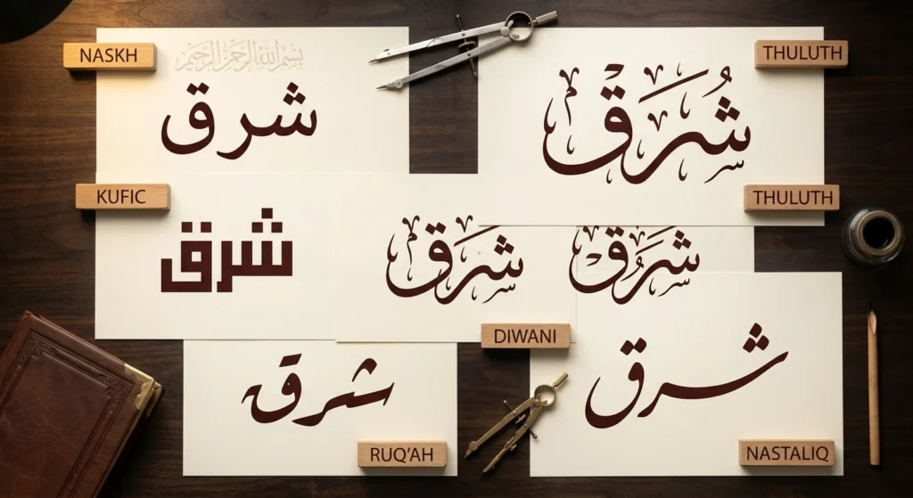
The Major Styles, One by One
Naskh: The Reading Script
The name means “copying,” and that’s what it does. Naskh is the clearest and most familiar style, the basis of most printed Arabic you’ll ever see. Its roots go back to the early Abbasid scribal tradition, and later masters such as Ibn Muqla (credited with systematizing proportion) and Ibn al-Bawwab refined it. Because its proportions are consistent and its letters are easy to read at small sizes, it’s the usual first choice for books, newspapers, websites, and Quran printing.
Thuluth: The Monumental Script
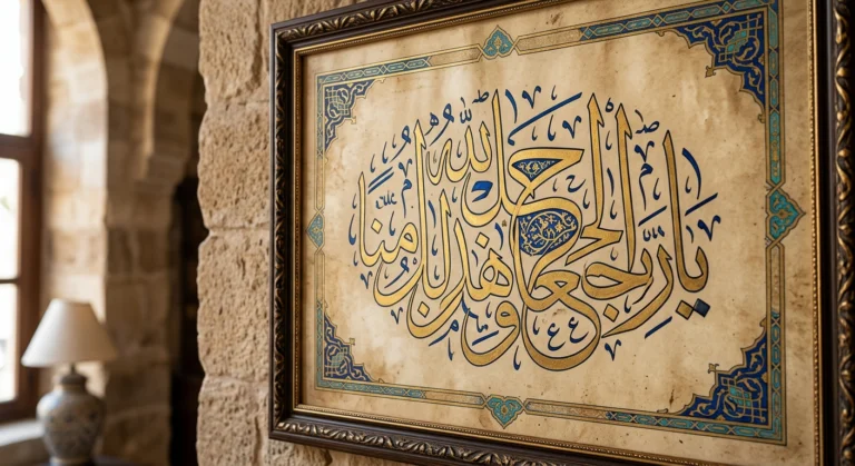
Thuluth is the style of grand inscriptions. Its tall, sweeping curves can be layered and nested, which makes it look good on mosque walls, domes, and ceramic panels. Explanations of the name vary, so treat any single one with caution. The tradition associates Yaqut al-Musta’simi with refining it. Thuluth rewards size, so it looks wonderful large and gets crowded when small.
Kufic: The Geometric Original
Named after the Iraqi city of Kufa, Kufic is one of the earliest formal Arabic scripts, found in early Quran manuscripts, on coins, and in architecture. Its forms are angular and horizontal, and variants include foliated and square Kufic, the latter common in tilework. Because it’s geometric, Kufic suits modern graphic design well, and many contemporary typefaces described as “Kufi” borrow its structure while simplifying it for screens. Historical Kufic can be hard for casual readers to read, so modern versions usually trade some tradition for legibility.
Diwani: The Court Script
Diwani developed in the Ottoman chancery, the diwan, from which it takes its name. Tradition credits Housam Roumi with its development, and it was used for official documents and decrees. The letters flow upward and press tightly together, and an ornate variant, Diwani Jali, fills the gaps with decorative marks. Today it appears mostly on certificates, wedding invitations, and decorative pieces.
Ruq’ah: The Everyday Hand
Ruq’ah is a compact, simplified script that emerged in the Ottoman world in the 19th century. It’s quick to write, which made it the practical handwriting of much of the Arab world, and you’ll see it on handwritten signs, menus, and notes. One common point of confusion is that the classical script spelled Riqa’ is a different, older style from modern Ruq’ah, though the names are easy to mix up.
Nastaliq: The Poet’s Script
Nastaliq grew in Persia during the 14th and 15th centuries, and tradition credits Mir Ali Tabrizi with its codification. Letters seem to hang from a slanted line and cascade diagonally, with strong contrast between thick and thin strokes. It became the standard for Persian and Urdu poetry and text. Digital Nastaliq is extremely complex, because the letters stack and shift in ways that simple fonts struggle to reproduce.
Maghribi: The Western Script
Maghribi developed in North Africa and Islamic Spain. Its rounded, open curves look noticeably different from eastern scripts, and it appears in regional Quran manuscripts. If you’re designing for a North African audience or want a distinct, less commonly seen look, it’s worth knowing.
Muhaqqaq and Rayhani: Classical Quranic Scripts
Two members of the Six Pens deserve a mention. Muhaqqaq is large and stately, associated with grand Quran copies of the Mamluk era, while Rayhani is a smaller, more delicate relative. They’re less common in everyday design but important in Islamic manuscript art.
How to Choose a Style for Your Project
A few questions narrow it down quickly.
How small will it appear? Naskh and modern Kufic style lettering hold up at small sizes. Thuluth and Diwani need room.
Does the text need to be read quickly? Choose Naskh or Ruq’ah for clarity. Save Diwani Jali for pieces meant to be admired.
What’s the mood? Kufic feels structured and contemporary, Thuluth monumental, Diwani celebratory, Nastaliq literary, and Maghribi regional and distinctive.
What’s the language? Nastaliq is the natural fit for Urdu and Persian, while Arabic projects usually lean on Naskh, Thuluth, Diwani, or Kufic.
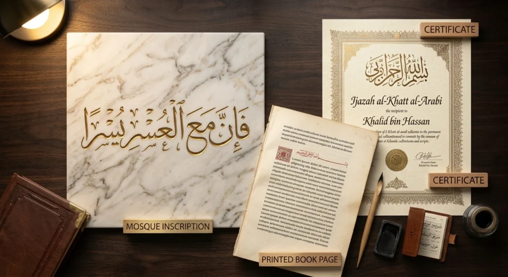
To compare options without guessing, type your word into the free Arabic Calligraphy Creator and view it in several styles side by side. Seeing the same text in Naskh, Thuluth, and Diwani makes the differences obvious in seconds, and it’s a quick way to test how a word’s letter shapes behave in each style.
Using Calligraphy Styles in Canva and Adobe
Design apps handle Arabic differently from Latin text, so a few things help here. Choose a font that actually supports Arabic, keep right to left direction turned on, and never space letters apart, since Arabic letters connect within a word. In Adobe Illustrator, you may need to enable its right-to-left text features before Arabic displays correctly. For a step-by-step walkthrough, see our guide to creating a logo in Arabic calligraphy. Fonts only approximate hand drawn calligraphy, so for important commissions, a trained calligrapher will produce more authentic work than any typeface.
A Quick Note on Accuracy and Respect
Before printing anything permanent, have a fluent Arabic reader check the spelling. Many people also consider Quranic verses and divine names sacred, so be thoughtful about using them in commercial designs or on items such as clothing, and ask people from the community if you’re unsure.
Choosing Your Style
The right Arabic calligraphy style depends on what the writing needs to do. Naskh is for reading, Thuluth for grandeur, Kufic for geometry and modern branding, Diwani for celebration, Ruq’ah for speed, Nastaliq for poetry, and Maghribi for the western tradition. Start by matching function to style, then test a few options visually. When you’re ready, try the Arabic Calligraphy Creator to see your own text in each one.