How To Use Arabic Fonts In Design Projects?
Using Arabic text in a poster, logo, or website looks easy until you try it. The letters appear backwards, they refuse to connect, or the design software swaps in a font that makes your headline look worse. These problems are common, and almost all of them are fixable.
This guide covers how to choose Arabic fonts, set them up correctly in design tools, pair them with Latin type, and avoid the mistakes that make Arabic typography look amateur. You don’t need to read Arabic to follow along, though a fluent reader should always review the final result.
What Makes Arabic Fonts Different?
Arabic fonts are digital typefaces designed for the Arabic script, which is written right to left and joins letters within a word. They differ from Latin fonts in a few ways that directly affect your design choices:
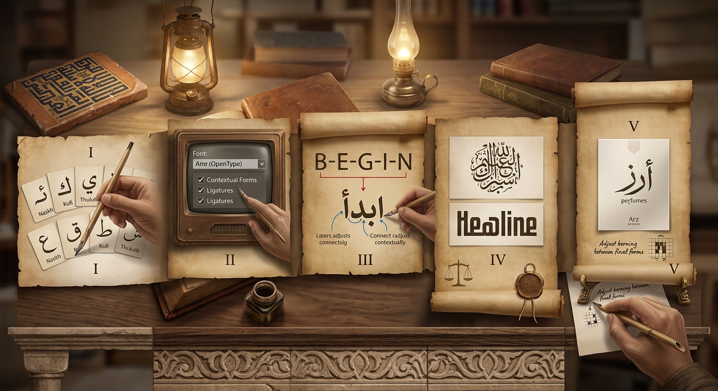
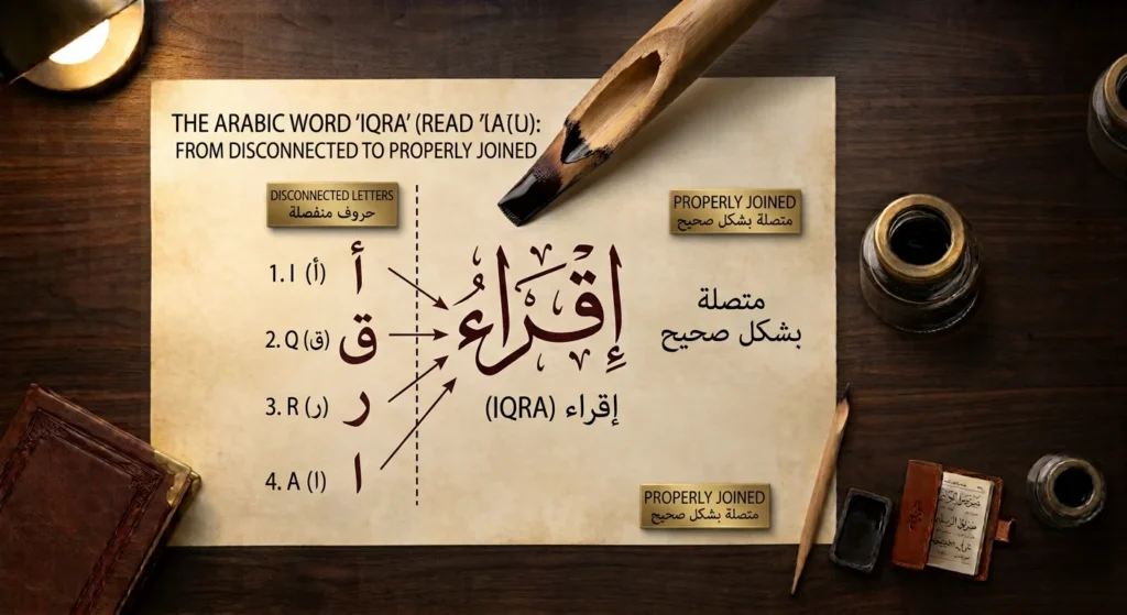
- Letters change shape. Most letters have isolated, initial, medial, and final forms. A good font contains all of them and the rules for choosing between them.
- Text runs right to left. Alignment, spacing, and layout need to be mirrored.
- Words sit on a flowing baseline. Letters connect along a line, with marks above and below.
- Dots and diacritics matter. Dots distinguish letters, and optional vowel marks (harakat) must be positioned cleanly.
This is why you can’t just “swap in” an Arabic font the way you would a Latin one. The font, the software, and the text engine all have to work together.
Where Arabic Type Comes From
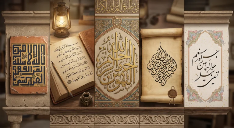
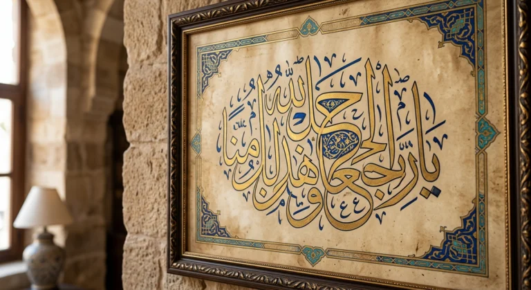
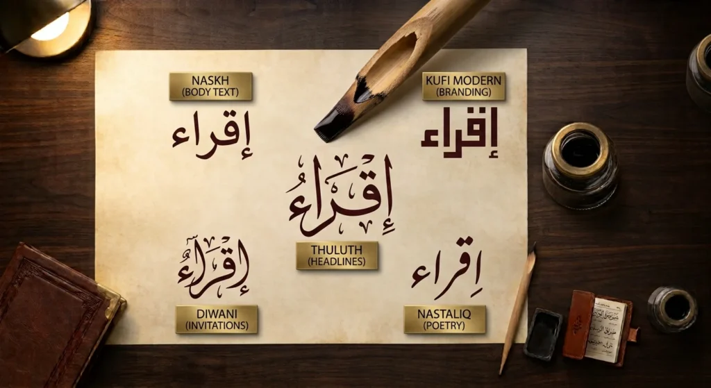
Most digital Arabic fonts descend from traditional calligraphic styles. Naskh is the model for much of the body text you see in books, newspapers, and apps. Kufic inspired many geometric display fonts. Thuluth, Diwani, Nastaliq, and Maghribi show up in decorative, ceremonial, and regional designs.
Knowing the lineage helps you choose. A font rooted in Naskh will feel familiar and readable, while one based on Diwani will feel ornamental and dense. If you want background on how these styles developed, our guide to Arabic calligraphy styles is a good companion.
Step 1: Choose the Right Style for the Job
Start with the purpose and not necessarily for the prettiest option.
Body text and long reading
Choose a clear Naskh based font. Look for open letterforms, consistent stroke contrast, and generous spacing. Dense decorative styles tire the eye over a paragraph.
Headlines and posters
This is where expressive styles shine. Thuluth-inspired fonts feel grand and formal. Kufi Modern and geometric Kufic suit tech, branding, and contemporary layouts. Diwani works for invitations and celebratory messages, though it’s harder to read.
Poetry, quotes, and Persian or Urdu text
Nastaliq is the traditional choice for Persian and Urdu. Be aware that it has a sloping baseline, so it needs extra line height and often a larger point size than you’d expect.
Logos and monograms
Choose a style with a strong silhouette. A logo should still read at small sizes, so test it at a few inches wide before committing.
Step 2: Check Language and Character Coverage
Not every Arabic font supports every language. A font that handles Arabic may be missing letters used in Persian (like پ, چ, گ) or Urdu. Before you start:
- Type a sample of your actual text, not just a sample line from the preview.
- Check that all letters, numerals, and punctuation render.
- If you need vowel marks, test that they sit correctly above and below the letters.
- Look for Arabic-Indic digits (٠١٢٣) if your audience expects them.
Fonts that only cover basic letters can leave gaps like empty boxes (often called “tofu”) or fall back to a different font mid-sentence.
Step 3: Check the License Before You Download
Font licensing hurts up a lot of designers. Fonts are legally protected, and the license controls what you can do.
- Personal use only fonts can’t be used for client or commercial work.
- Commercial use licenses vary on whether they cover print, web, apps, or logos.
- Open-source license such as the SIL Open Font License, generally allow commercial use, but you should read the specific terms.
If you’re downloading from our site’s font pages, check the license notes on each font’s .zip file. For any font from any source, keep the license file with your project records, especially for client work.
Step 4: Set Up Your Design Software Correctly
Installing the font is only half the job. Your software also needs proper right-to-left and complex script support.
Adobe Illustrator, Photoshop, and InDesign
Use the Middle Eastern or World-Ready versions of the Adobe apps, or enable the Middle Eastern language options in the settings, to get correct Arabic shaping. Without them, you may see disconnected letters. In InDesign, the World-Ready Paragraph Composer handles Arabic correctly, and you can set paragraph direction to right to left.
Figma and Canva
Modern browser-based tools usually handle Arabic shaping automatically, but check that your chosen font appears in the font menu and that text direction is set correctly. Paste your text rather than typing it character by character to catch rendering problems early.
Microsoft Word and PowerPoint
Both support Arabic, but you’ll want the right-to-left button on the ribbon active, and the font set specifically for the complex script setting.
Web design
Use CSS, not images of text, whenever possible. Set the language and direction on your page or element:
lang="ar"anddir="rtl"in your HTML..- A font stack that lists your Arabic font first, then a safe fallback
- WOFF2 files for faster loading.
Using real text keeps your content searchable, accessible, and editable.
Step 5: Pair Arabic and Latin Fonts
Bilingual layouts are everywhere, ranging from product packaging to museum signage. The goal is for the two scripts to feel like they belong together.
Match these qualities rather than trying to match shapes exactly:
- Weight. A bold Latin heading beside a light Arabic one will look unbalanced.
- Visual size. Arabic often looks smaller than Latin at the same point size, so you may need to increase it by a couple of points.
- Contrast and mood. A geometric sans-serif Latin face pairs naturally with Kufi Modern, while a traditional serif often sits well with Naskh.
- Baseline and alignment. Check how both lines sit together, particularly in buttons and menus.
Many type families now consider Arabic and Latin as a designed pair, which saves guesswork.
Step 6: Get the Details Right
Small adjustments separate polished work from clumsy work.
Line spacing. Arabic usually needs more leading than Latin because of marks above and below the baseline. Start around 1.5 to 1.8 times the font size and adjust.
Letter spacing. Avoid adding tracking to connected Arabic text. It can break the joins between letters and look wrong. If you need to stretch a word, use a font designed with kashida (elongation) or a tool that supports it.
Alignment. Right-aligned is the natural default for Arabic. Don’t center long paragraphs, and avoid justifying narrow columns.
Mixed text. When Arabic includes English words or numbers, the text engine handles the direction switch. Check punctuation placement, because it can end up on the wrong side.
Bold and italic. Arabic has no true italic tradition. Using a fake slant looks awkward. Use a font’s real bold weight, or choose a different weight in the family.
Contrast and color. Thin strokes disappear against busy backgrounds. Test at small sizes and on mobile screens.
Common Mistakes to Avoid
- Typing Arabic letters in isolated form so they never connect
- Using a font that doesn’t support the language you’re writing
- Copying Arabic from a source that reverses the characters
- Adding letter spacing to cursive text
- Using decorative styles for long paragraphs
- Publishing without a native-reader review
The last one really matters. A single missing dot can change a word, and calligraphic styles can make errors harder to spot.
Using the Arabic Calligraphy Creator as a Starting Point
If you’re not sure which style suits your project, it helps to see your own text before you commit. With the Arabic Calligraphy Creator, you can enter Arabic text and view it in Naskh, Thuluth, Diwani, Nastaliq, Kufic, Maghribi, and Kufi Modern. It’s a quick way to compare moods side by side for a logo, invitation, or social post.
Once you’ve picked a direction, you can head to our Arabic fonts download page to find matching fonts for your design. Check the license notes for each font before using it in commercial work.
Key Takeaways
Good Arabic design starts with matching the style to the purpose such as Naskh for reading, expressive Kufic, Thuluth, or Diwani styles for display, and Nastaliq for Persian and Urdu. Confirm that the font supports your language, check the license, and make sure your software handles right-to-left text properly. Pair scripts by weight and mood, give the lines room to breathe, and avoid tracking cursive text.
Most important, have someone who reads Arabic review the final design before it goes to print or online.